Keeping Your Palette Fresh, Varnishes, Choosing Reds & Blues
For this Q&A I’m outside in my backyard. The leaves have changed and it’s a beautiful clear day.
"How often should I change out my "Sta-Wet Palette" to prevent must and mildew?"

05:58: I change mine every week by wiping it out and rinsing the sponge. If you watched Color 101, you might remember that Dianna Shynne uses blue shop paper towels in place of the sponge. If you use those, you can just throw them away when it starts getting a little bit smelly. Also, you can always use just a tiny drop of hydrogen peroxide which will kill the smell of mildew.
"Can you explain your reason for selecting Quinacridone Magenta or Quinacridone Red over Alizarin Crimson hue in your limited palette? Also, your Color 101 course is magnificent."

The problem with alizarin crimson is that it's not good for aging, because the light fastness of it is really bad, so it will fade quickly. Alizarin crimson is made by mixing quinacridone magenta or quinacridone red and a little bit of something like burnt sienna or some kind of earthy color.
08:24 I don't use that hue of alizarin crimson in my limited palette because it's a mix. They're just taking the quinacridone color, which is purer and they're mixing it with something earthy. So, in my opinion, I would rather have a more pure color because I can always mix it with something else and get it to be earthier. But if I already have it mixed, I'll never be able to get it to that more pure state.
"Are there going to be more Paint-Alongs coming?"

Yes, there are, but they're going to be in a slightly improved, more student-focused format. We're going to have them embedded into a monthly "Acrylic Like a Boss" track fairly similar to the older Paint-Alongs, but we’re making updates. My older Paint-Alongs now have new audio, so if you’re someone who struggled through while I told stories, there are now better audio tracks with explanations of my techniques. The new "Acrylic Like a Boss" tracks will be glorified Paint-Alongs that will walk you through more in-depth design aspects. So, instead of just jumping right into the painting, I'll start by looking at the photograph; talking about the design, explaining why I'm making the choices I'm making––then we'll do the painting and we'll do a follow up at the end. So yes, they're coming and in a newer, improved format.
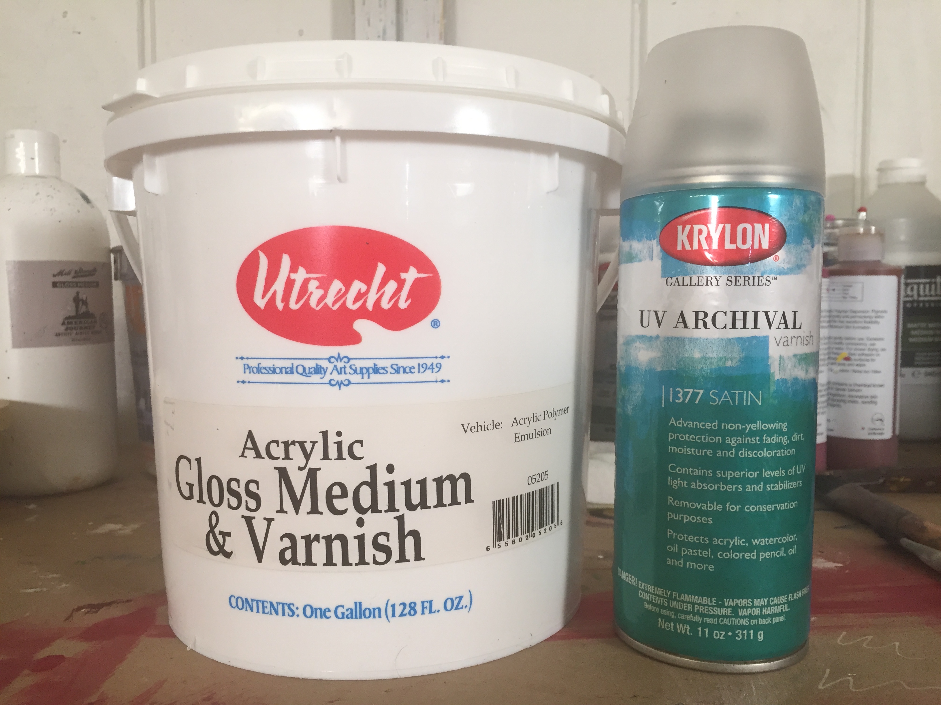
"What type of varnish do you use on your paintings? Gloss or matte or a combination of both? Any advice on the application?"

12:47 As far as semi-gloss versus matte, I prefer something in-between. My favorite kind of semi-gloss is a satin finish because it's not overly glossy. For best results with paint-on varnish, sometimes I mix two together. I'll mix a little bit of matte and high gloss and apply that mixture. Spray varnish is available in both semi-gloss or satin, so it's a little easier with the spray varnish to get the sheen that you want. You can also put on something called an isolation coat, which is basically like an extra layer in-between used for archival purposes. I have never done that in my painting practice. If for instance, you want your paintings to be able to be retrieved years down the road, the isolation coat provides a layer between the paint and the outer varnish. The outer varnish can be removed and it won't pick up the paint––it will only strip down to the isolation coat.
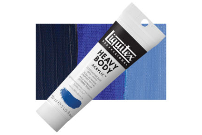
"I'm starting to buy some paints after having used up some old stuff and wanted the correct Ultramarine Blue. Liquitex has both the red shade and the green shade. And they use the same code, like it's PB29 on both. So why is one red and one green?"

14:28 Making pigments is similar to cooking. When making a pigment, they can cook it longer or shorter, and it will change the outcome. For instance, you could scramble an egg or you could cook it over-easy and the results are quite different, but in both cases, you started with an egg. That's kind of how I think they create a red shade vs. a green shade of ultramarine blue. Most ultramarine blues are the red shade. So if you ask "Can I use the Dick Blick standard ultramarine blue?" Yes, you can. That would be fine. If it doesn't say green shade, it's always going to be the red shade of ultramarine blue.
"Do you prefer to paint on a canvas panel or a stretched canvas?"

16:07 My preference is to paint on the stretched canvas because it's easier. You do have to paint the edges, for it to appear finished, but it keeps the overall cost down because you don’t have to frame it. You can paint the edges, attach a hanger and sell it for a little bit less than if you had to pay for a frame. Whereas with a panel, it will need to be framed to hang it.
17:22 If you are showing work in galleries, you want to have a very professional look. In modern contemporary galleries, artists often don't frame their work. But, in most traditional galleries, almost every painting is framed. When I started showing in galleries again, we began framing the smaller pieces but just painted the edges of the larger stretched canvas paintings where the cost of framing would be exorbitant (like maybe $1000).
"If I'm using the panels, what's the best and easiest way to hang a canvas panel painting?"

18:24 The easiest way is to buy your canvas panels in standard sizes for which you can also get affordable frames. Good sites to look for frames and panels are dickblick.com or Cheap Joe's. For instance, for a 9x12 panel, you can get a frame for about $20 or $25. If you use a particular size a lot, you can order a box of frames with three or six frames in the box bringing the cost down even more.
19:32 As far as the time to prep a panel vs a stretched canvas for hanging, it’s really about the same. If the painting is unframed you have to paint the edges, and if going framed you have to attach the frame. Both require attaching a hanger. If you’re selling your work, you’ll want to consider what your buyers prefer. Some people prefer the look of a frame while others prefer unframed.
"I was working on the color wheel in Color 101. I completed the wheel as you painted in the video. However, I was lost immediately as to how to progress with the double primary palette to the split primary palette. I was wondering how you made progress past this point."

20:52 I'd encourage you to keep going with the Color 101. Break up the split palette and I take one of the primaries out. Then use them in a limited way. For instance, take one red, one blue, one yellow and use it in a limited palette. To me, that’s the simplest and easiest way to feel confident about painting. If you are using just three colors, you can't go wrong with your color mixes. You will always have paintings that work together, and you can make them beautiful and vibrant.
22:18 That's how I would suggest moving forward. If you're wanting to use both of the primaries, you can, it just takes more thought in your color mixing. Like which blue are you using and for what? It's a little bit more complicated to use all of the colors. It's easier to use one of the primaries, by selecting one of them and using a simplified primary palette, or limited palette.
Limiting your color palette is kind of freeing for people to not have to worry so much and to get used to mixing colors. The direction that I'm moving in terms of my overall painting technique is to simplify my color choices. When I’m nearing the completion of a painting and I see that it may benefit from having something like a more vibrant blue, or if I cannot get a certain color–then at the very end of a painting, I might bring in an alternate color that will add an extra punch to the painting. But 95% of the painting is done with colors that I know are going to be harmonious. And then the last little added color can bring some pizazz to the painting without taking it over the top or making it look too funky.
Stay connected with news and updates!
Join our mailing list to receive the latest news and updates from our team. You're information will not be shared.

