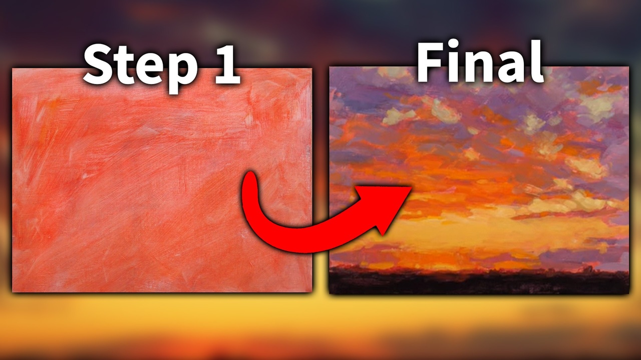
How to Paint Clouds Step-By-Step
We all love looking at clouds, but painting them can be another story. It can be a pretty daunting proposition. Just like so many other parts of nature, clouds are incredibly diverse and awe-inspiring. How can we possibly capture them on canvas? They loom large in the sky, day in and day out. They are always moving and changing as the wind blows them.
Before we jump in and learn how to paint a cloud scene step-by-step, I’m going to share three keys I learned. These three things really helped me.
- Where is the light in your scene coming from? Pay attention and locate the light source. This will affect which parts of your clouds are the lightest and darkest in value. Light can come from above, behind, below or from a combination of directions.
- Because clouds are not solid, we need to keep our edges soft. This is especially important when working with Acrylics, as this medium can be more challenging when trying to create soft edges.
- Pre-mix your colors (highlights, half-tones and shadows) and keep them accessible throughout your painting process. If your sky takes up a large portion of your painting, you will need a good amount of paint, and having it premixed will help keep your colors consistent and your edges soft.
Now, let’s begin! First, I want to talk about our reference photo. How many times have you - wherever you live - tried to capture a beautiful sunset or sunrise with a camera? The clouds are radiating with the most beautiful warm pinks, yellows, oranges, peaches, and reds. We try to soak up all the beauty because we know it will be gone in a few minutes. Often times, this is when we pull out our cameras to help capture the fleeting glory, only to look at it later and think, “The real thing was just SO much better.” A photo can just never do it justice!
Below is one of those scenes, and of course, my photo didn’t do it justice. But we’re going to apply our knowledge of what our eyes know sunsets can be, and in this lesson, make it as beautiful as possible. In our reference, the light source is coming from below and lighting up the undersides of the clouds. Notice how low the horizon line is. This means we can really focus on the star of the show… our cloud-filled sky.

Materials
I'm using a 12x16 canvas. You can use a similar (or larger!) size if you like.
These are the colors that I'll be using:
- Titanium White
- Cadmium Yellow light
- Cadmium Orange
- Quinacridone Red (PV19)
- Ultramarine Blue
- Mars Black
- Neutral Grey
Starting Out
I always recommend beginning with a thumbnail sketch! It takes just a minute to sketch and it really helps for understanding the general values before moving on.
The Process
- I'm starting with a white canvas. But this is going to be a vibrant sunset! So, let’s mix up a warm mixture of Quinacridone Red and Cadmium Orange for our underpainting.

- Then, we’re going to premix the rest of our colors. Start by combining large amounts of red, blue, and bit of grey. This mixture will work for the darker values of the sky and clouds. On the edge of this mixture, mix in some orange and white. The goal is to have similar colors, but in different values.
Next, let’s mix our highlights. In a different area of your palette, combine Cadmium Yellow and Cadmium Orange. I found that just these two colors combined was a little too bright, so I toned it down with Quinacridone Red. And that’s all the basic pre-mixing we’ll need for our clouds!

- Next, mix some blue and red into your black and roughly paint in the foreground.

- In this step, we’ll begin blocking in the main colors from our premixed blends. I want you to focus on simply referring to our reference photo getting the basic values nailed down. Use chunky brushstrokes. Don’t get caught up in the details! We can add those later. Also, keep in mind that the light source is coming from below, right above the foreground. The clouds will decrease in saturation as they move away from the light source.

- Look back at our reference photo. Do your see that golden sky peeking through where there are no clouds? Follow it all the way up to where it peeks through the clouds. You'll see that there's almost a green-ish tone. That's what we'll mix up now. It's the lightest value that we'll have in this piece (except maybe a couple highlights). Simply mix Cadmium Yellow and White together. Start by blocking it in. And, as you work your way down, add in some orange. This is the most intensely warm area of our piece. As we paint, let's be mindful of our brushstrokes. Move the paint up, down and sideways. The scene has a lot of depth so let's try to capture it as best as we can.

-
Good job! We’re almost finished. In this last step, let’s start by once again referring to our reference photo. As I mentioned earlier, the golden sky in the background turns into a cooler, greenish-toned color, when it peeks through the upper clouds.
So, let’s mix in a small amount of blue to our yellow/white mixture. We want to cool this area of the painting down because we're moving away from our light source.
Now, I’m going to work on adding some subtle design and highlights on the undersides of the clouds. Adding some lowlights on the top of the clouds is also a great way to add more depth. If you’re having trouble with the transitions of the clouds, I would recommend using more of our premixed mid-tones to make the color shift softer. The final thing I’ll do is take our lightest paint mixture and use it to shape and refine the golden sky area. At this point, I’m going to call my personal practice piece finished, but you can go on! If you want, you can add in the silhouettes of trees, fenceposts, or a telephone line in the foreground, or even a low mountain range or foothills in the distance. You’re the boss of your painting!

Conclusion
I hope you enjoyed this tutorial! A while ago, I heard a fellow artist remark on how cloudscapes were his favorite subject. His reason? He could paint the sky a thousand times and never do it the same way. I heartily agree! And as always, I would love to see your work and hear what you learned, using the hashtag #jeddorseyfineart and #acrylicuniversity. I love how we can learn and grow together, and see what we all come up with! Happy cloud painting!
Do you have a problem with keeping your Acrylic Paints wet? Are you new to Acrylic painting? If so, you need to check out this article on the amazing paint box and sta-wet palette for Acrylic painters.
In our next lesson we paint mountains step by step! Go check it out here
Stay connected with news and updates!
Join our mailing list to receive the latest news and updates from our team. You're information will not be shared.